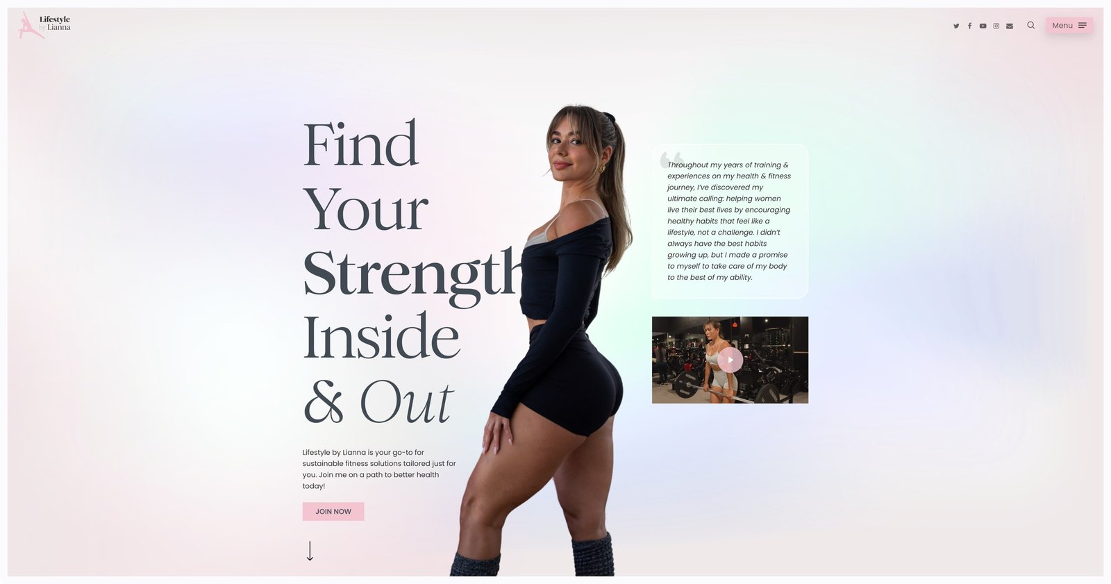
The visual style and color palette for the site took inspiration from ballet pinks and soft pastels to create an airy, feminine aesthetic. Neutral tones like white, cream, and light grays helped keep the design feeling light and fresh.
The overall tone aimed for a modern update on the classic 90s fitness magazine vibe. Clean lines and minimalist layouts balanced inspirational imagery and content in a way that felt both retro-nostalgic and on-trend. The goal was to evoke a sense of empowerment and achievability through a design aesthetic that felt optimistic, uplifting and just a touch nostalgic.

